the Hackathon
In May 2017, students from General Assembly's User Experience Design Immersive (UXDI) and Web Development Immersive (WDI) programs were challenged to collaboratively design and build an app from scratch. Our randomly-assigned team was able to design and build an award-winning web app inside of 24 hours for General Assembly's Seattle Hackathon.
As a member of a five-person team (two full-stack developers and three UX designers), I was primarily responsible for user research, user flows, and wireframes.
The Challenge
"Pebble In The Shoe" was theme for this hackathon, and our challenge was relatively straightforward: identify a minor inconvenience in our lives, then create and present an MVP that addresses the problem.
We began by brainstorming a list of 12 minor problems, which we narrowed down to one: properly planning and executing a barbeque is hard.
“Any barbecue that requires more than one package of hamburger is hard to plan.”
In particular, our shared experiences indicated that barbecues (and similar events, like potlucks) are prone to being poorly-executed unless thoroughly planned in advance. Although a great many people use Facebook to plan these types of events, its lack of focus in this arena presented several opportunities that a purpose-built app would be able to more effectively address. Primarily, that these kinds of events rarely have a readily available, easily-shared list of what to bring. As a result, most people—without proper guidance—typically grab whatever is easiest on their way out the door or en route to the event (and if you've ever hosted a barbecue that evolved into a "chips and salsa" party, you may be familiar with this phenomenon).
Research & Planning
I conducted a series of user interviews to validate our ideas around these experiences.
The first two interviews supported our original idea that guests tend to bring something easy (like chips and beer, or soda) unless given specific instructions from the host.
The last two interviews provided two key pieces of information:
People will change their behavior given adequate information about what others are doing.
The difficulty of planning an event increases exponentially with the number of attendees.
Based on these findings, I created a proto-persona for whom we would tailor our design: Erin, an active professional in her twenties who prefers to communicate via text message or email, and would rather not delegate individual tasks to every single one of her party guests.
Designing The solution
To address the main challenges faced by Erin when planning these types of events, we decided to design a barbecue-planning web app that allows hosts to tell people where to go, when to be there, and share a list of what to bring.
From a guest perspective, the app would allow users to "claim" an item to bring to the event, see who is bringing what, have the option to contribute non-listed items, and split costs for shared items via Venmo or a similar peer-to-peer payment platform.
Originally dubbed "BBQueue," we quickly renamed our app Grillist and got to work.
User Flows
I created a flow diagram to illustrate how Erin would use Grillist to create an event, create a "grill list" of items her guests should bring, and then share the event via text, email, or social media.
To help our developers visualize the key screens they'd need to build, I also quickly whiteboarded some screen flows for both the event host and the attendees.
Host User Flow and key screens sketched during initial whiteboarding session
We originally wanted to avoid forcing guests to register on the site or authenticate through a third-party platform just to RSVP to a Grillist event. Early designs allowed event planners to share a event-specific "party code" that would allow users to view the event. To enable better control over who can view a given event, later iterations on our design used a phone number to authenticate against a list of invitees. We also added the ability for guests to create a user nickname to facilitate cost-splitting with other attendees.
Early Sketches & prototypes
As our devs began coding key screens and functionality, I created paper prototypes to be used for some quick-and-dirty user testing. Working with Serge, our product manager, I was able to focus on optimizing the event creation flow over 5 rounds of user testing and iteration.
Due to the simplicity of our prototype, most of the feedback we received was related to form design and layout, although we also incorporated an event management dashboard/landing page from which users could manage multiple events.
Sketches from the first paper prototype, including notes on how we might implement user feedback in successive iterations
Later iterations of the prototype, including a Dashboard for creating and managing multiple events
Revised "Grill List" screen from host's event creation flow allows host to list items they don't need attendees to bring
During the design process, we received some interesting feedback from our users: the ability to tell guests what not to bring was just as important as telling attendees what they should bring. More user testing revealed that allowing users to input a comma-delineated list for both categories was the simplest way to accomplish both tasks.
We tested multiple versions of this feature, including one that would suggest popular items for each category, depending on the type of event.
Wireframes
I iterated upon my designs after each round of testing, and once I was confident that we had arrived at a fairly comprehensive set of features for our primary persona and user scenario, I created higher-fidelity wireframes to hand off to our devs.
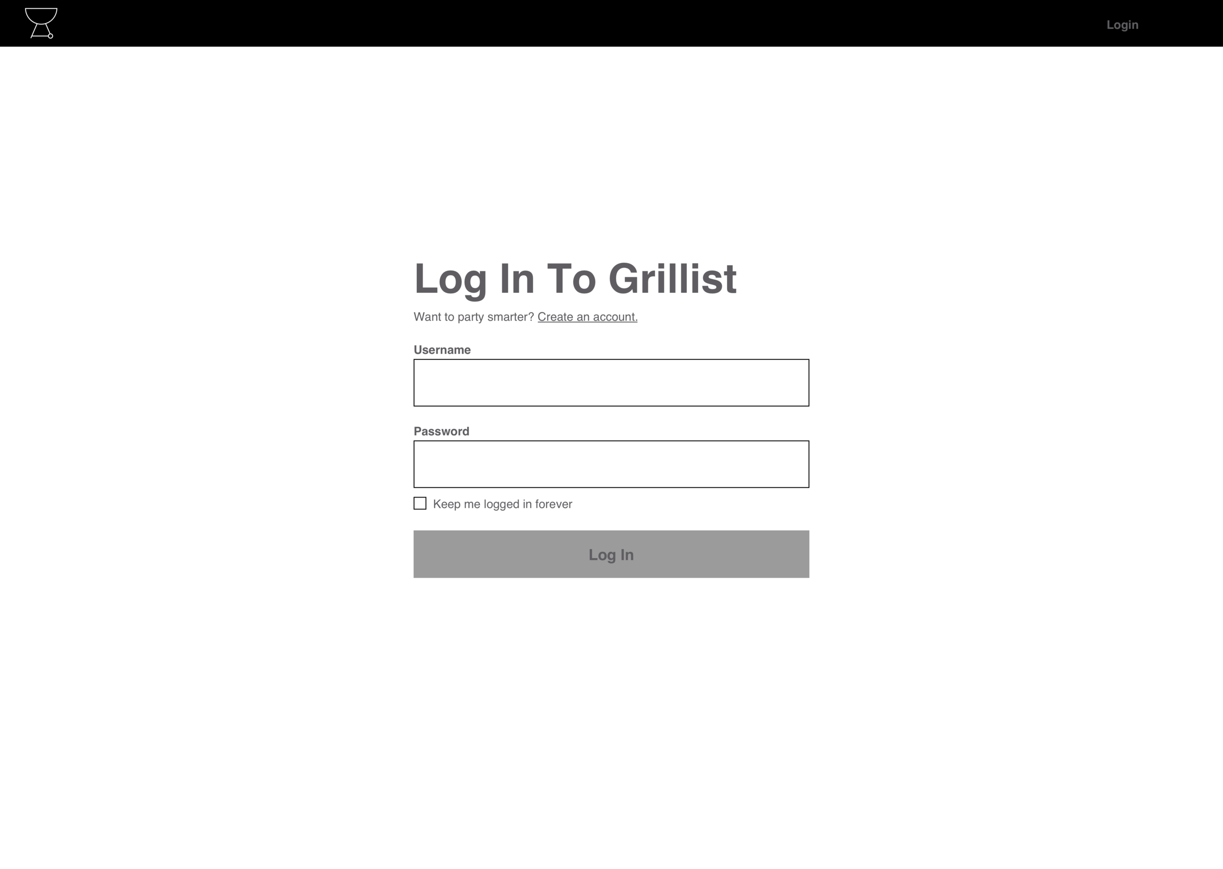
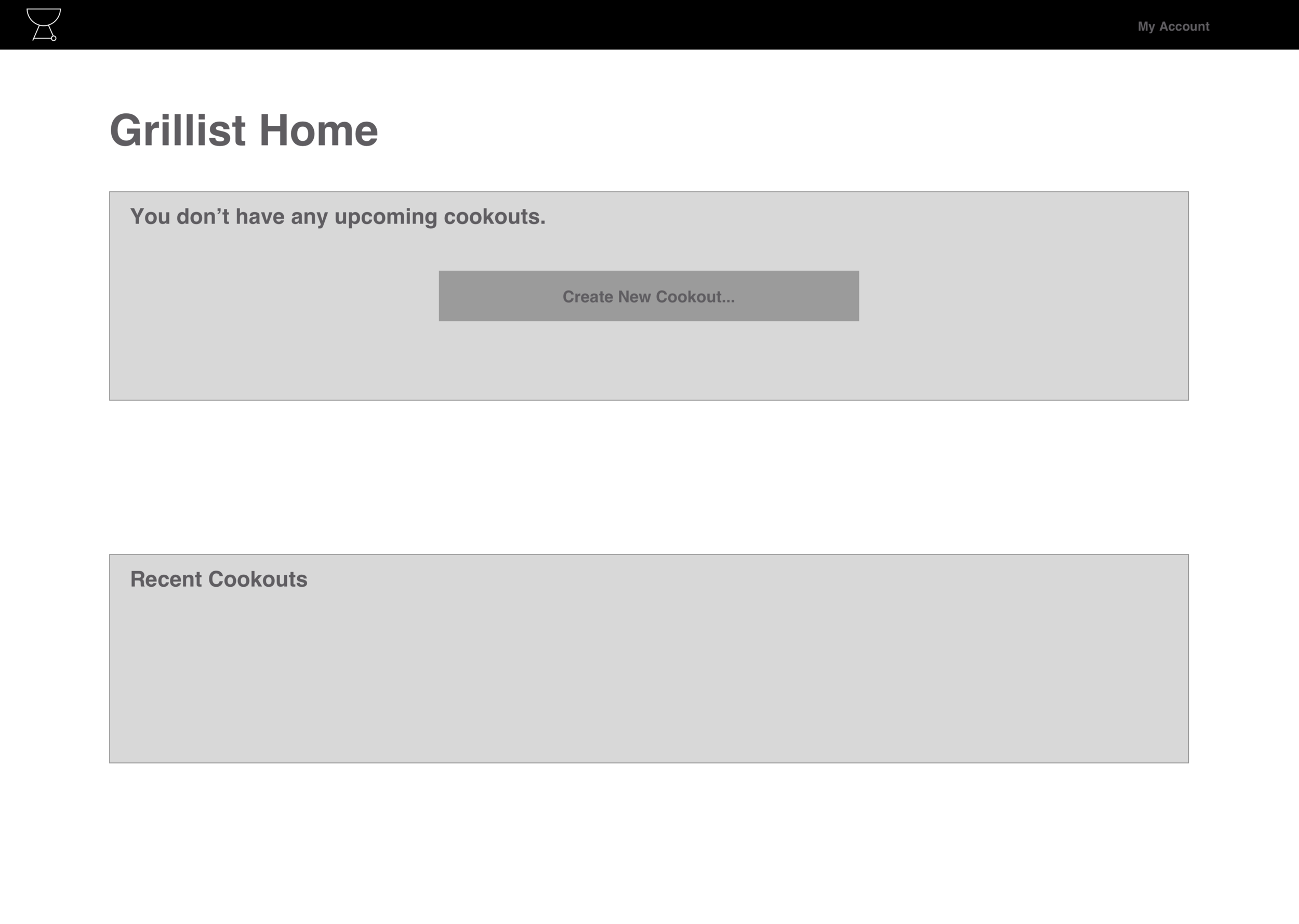
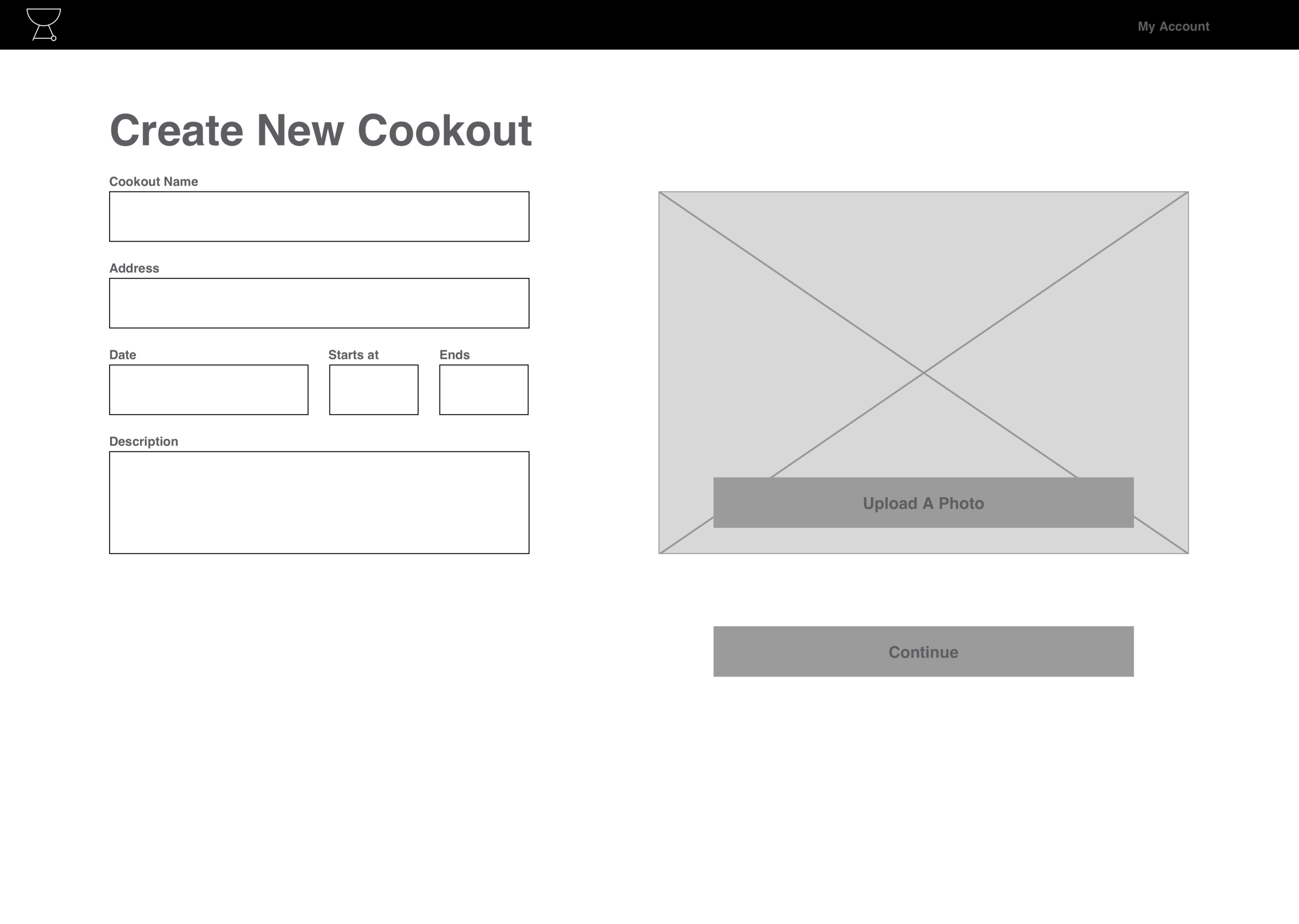
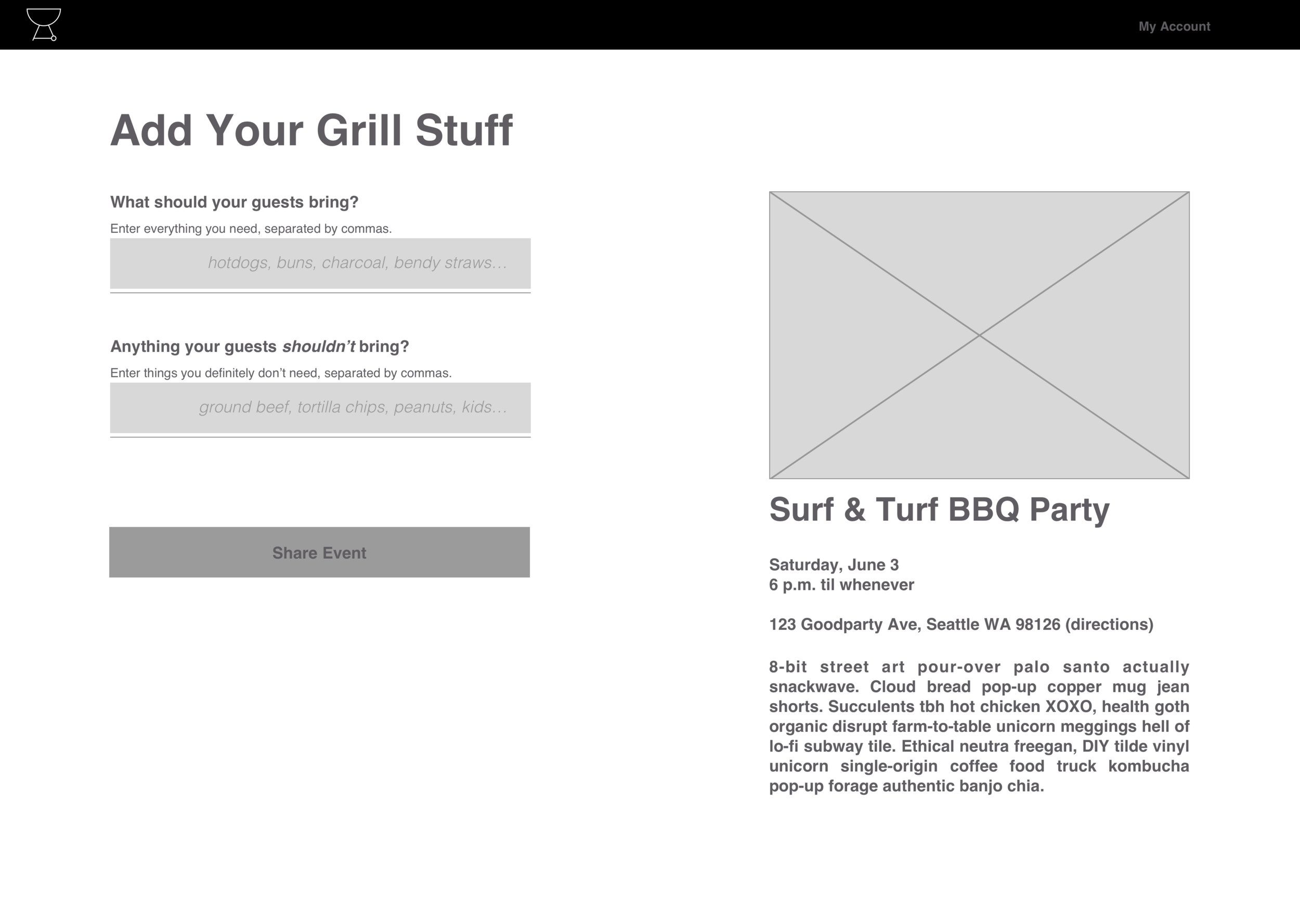
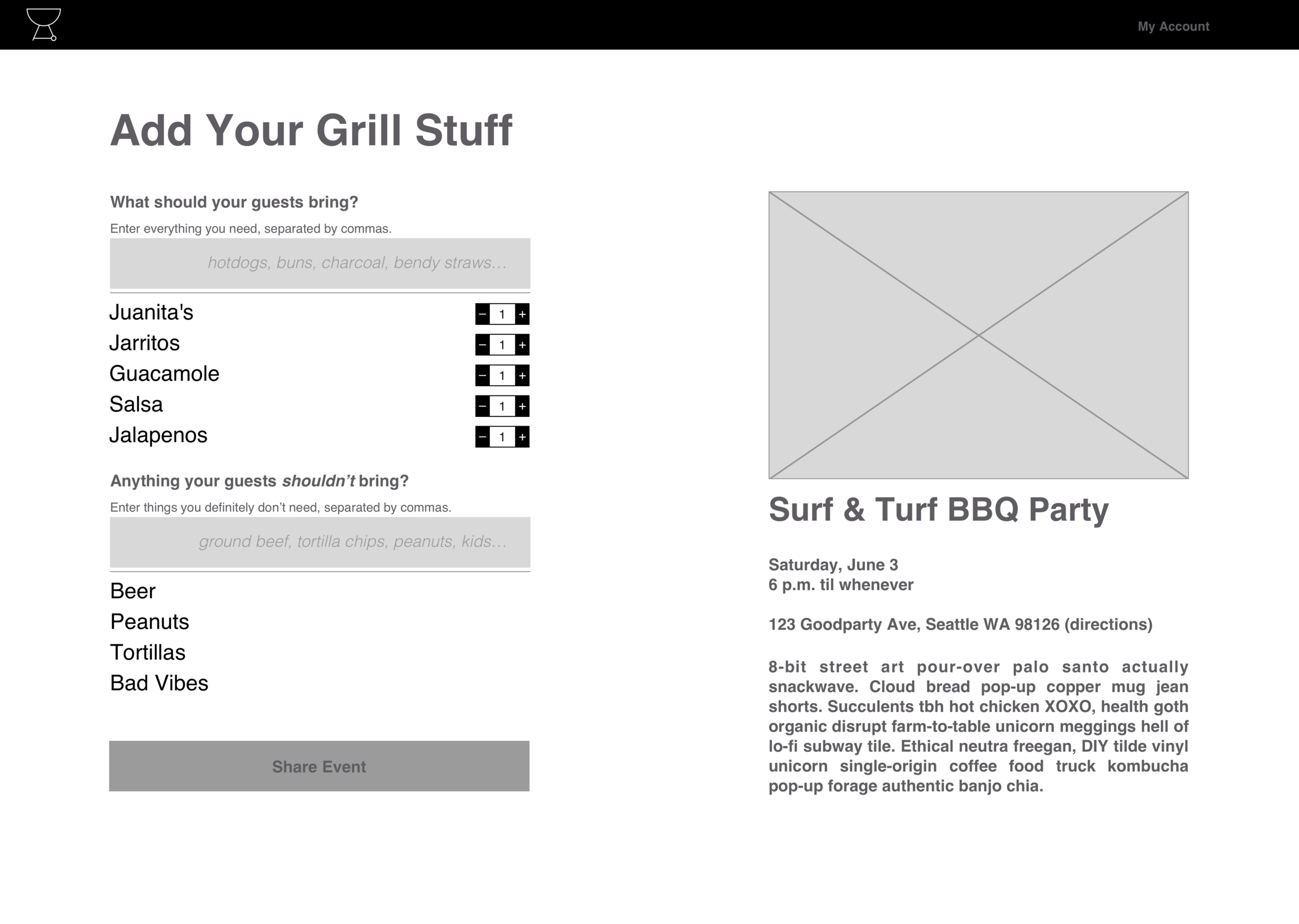
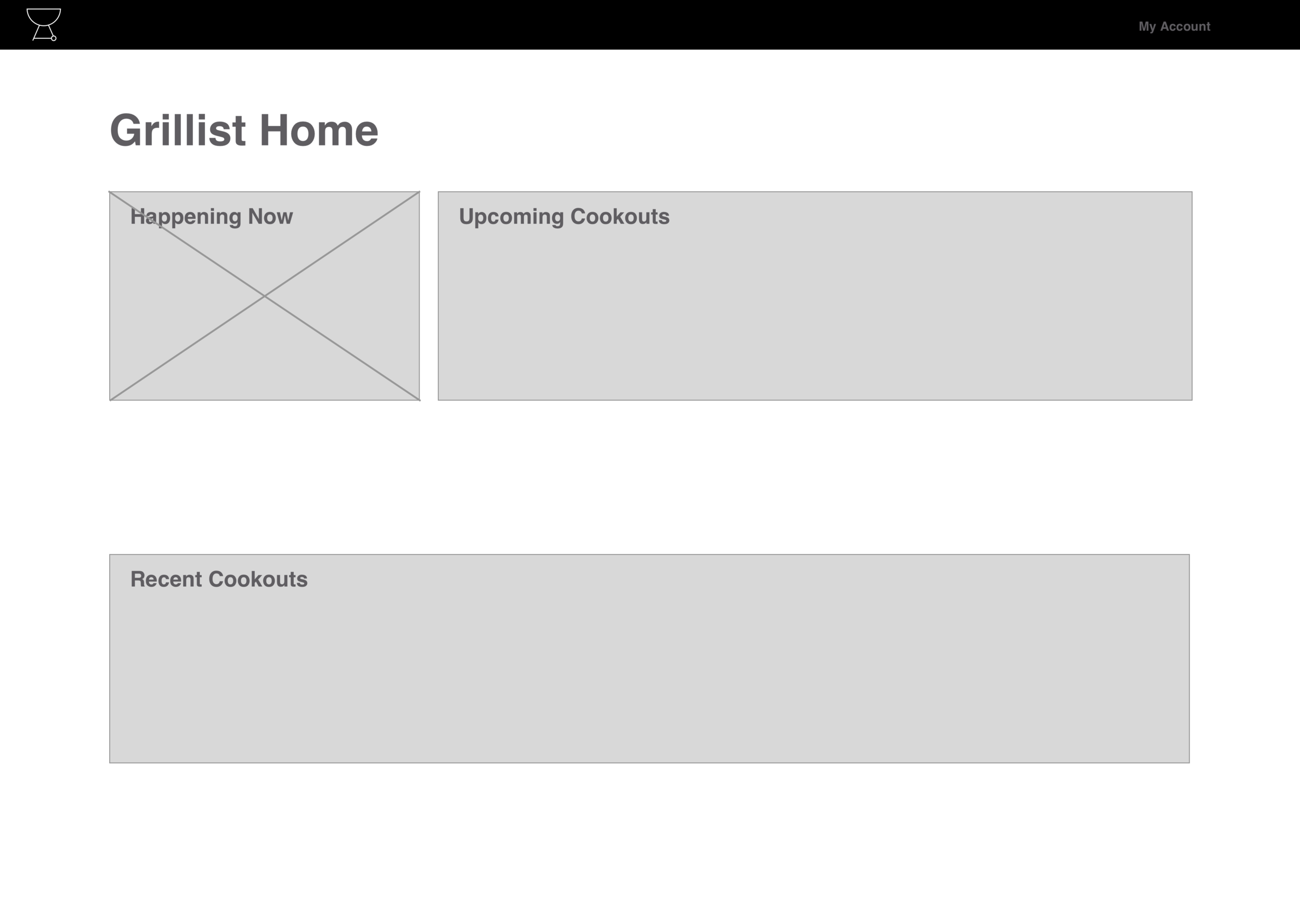
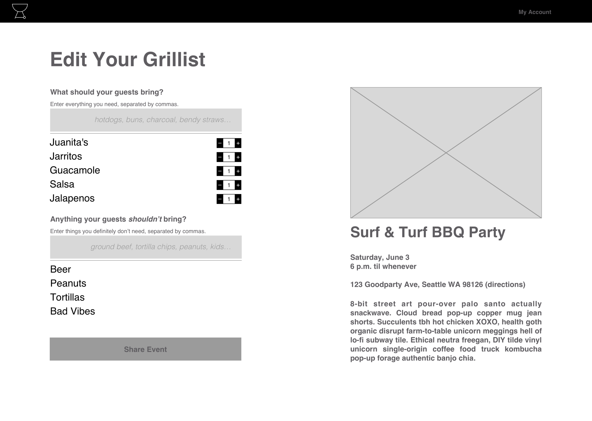
With our MVP scoped out and our devs sprinting toward a functional prototype, I continued to user test the event creation wireframes and recorded notes to facilitate further refinements to the design.
Conclusion
At the deadline, Grillist was complete enough for us to demonstrate how the barbecue-planning functionality we designed was able to address our "pebble in the shoe" problem. I presented the Grillist prototype to the General Assembly UXDI and WDI cohorts and a panel of six judges, comprised of GA instructors and alumni.
In general, Grillist was extremely well-received. Many of the questions asked after our presentation were around when the app would be fully functional, or at least functional enough that people could begin using it to plan barbecues and other events. Our team was evaluated on the app itself as well as the presentation of our design, and we took second place overall.
what I'd do Differently
Post-hackathon, it occurred to me that I may have been overly focused on making sure that the designs I handed off to our devs were closely tied to what they could reasonably produce during the allotted time. If I could do this again, I'd continue to design for multiple users and user scenarios after the MVP design was complete (instead of chasing incremental improvements for one target user). This approach may have let us go beyond simply demonstrating functionality for event hosts—for example, we would have been able to present user-tested and validated screen designs for attendee user flows and speak more concretely to our next steps for development.
What's Next
Grillist was technically functional when we presented it, but a few additional steps would be needed to fully realize our design vision. Most importantly, I'd design and test screens for attendee user flows—everything from receiving a Grillist event invitation, to RSVP'ing to an event, to claiming a grill list item and beyond. Secondly, I'd design and test layouts for a mobile version of Grillist, which was out of scope during the hackathon. I'd also want to design and test the ability to split item costs within the app.
Key Takeaways
For me, this project really highlighted the amount of time required to take a product design and create a functional MVP. As a designer, it's fairly easy to design something in 5 minutes that could take 5 hours (or significantly more) for a dev to build. I had enough familiarity with various aspects of development to understand that going in, but working this closely with devs made that understanding dramatically more "real."
The amount of enthusiasm users had for this app—even during the early testing phases—was extremely encouraging. I've long wanted to cultivate some web development skills, and this project ended up being a major contributing factor in my decision to take real steps toward supplementing my UX design abilities with web development skills.


