
the client
The Seattle Art Museum (SAM) has been the center for world-class visual arts in the Pacific Northwest since 1933. SAM’s galleries include collections from their own archives, temporary installations, and special exhibitions from around the world. Their collections include works from many different cultures, including modern and contemporary art.
The Challenge
“Seattle Art Museum wants to provide engaging multimedia content for visitors and are interested in the possibility of self-guided tours. How well does this address visitor pain points and goals?”
Unlike other well-known museums, SAM does not currently have a native mobile application. My team and I were challenged with designing a conceptual companion app specifically for the SAM.
Our goal: Provide engaging multimedia content to enhance the museum experience and engage museum goers before, during and after their visits. The ability to provide self-guided tours was of particular interest, in addition to encouraging repeat visits and increasing attendance at events and special exhibitions.
Research & Planning
With a fairly detailed project brief in hand, we first created an online survey to get an idea of the common pain points experienced by museum goers and the factors that influence their decision-making process around museum engagement.
We distributed our survey through various channels, including the Seattle Art Museum Facebook page, and within 24 hours were able to begin synthesizing data from 27 respondents.

Some common themes we noticed very early on: many participants were interested in being able to easily learn more about specific art objects, and almost everyone we surveyed decided to visit SAM based on word-of-mouth from friends or social media connections.
Given the short-form nature of our survey responses, I conducted interviews with 7 participants to deep-dive into answers and collect more qualitative data. I wanted to identify specific ways in which we could streamline the museum experience, learn what supplementary information would be most valuable to our participants, and explore which past museum experiences were the most memorable and why. In addition, I wanted to pin down the biggest pain points for customers that could easily be addressed with a mobile app.

Affinity diagram aggregating the needs, wants and pain points of the museumgoers interviewed by our team.
As it turned out, many of my interviewees made the decision to visit SAM on impulse after finding out about an event or exhibit via social media or word of mouth. Unfulfilled interest in a SAM exhibition was often due to an inability to immediately convert that interest into a ticket purchase. Concerns about visitor volume, traffic and parking availability and a general uncertainty about museum hours were also factors that prevented museum visits.
Almost universally, the most memorable experiences were those that had some degree of immersion or interactivity. These experiences often sparked a desire to know more about a specific artist, art object or exhibit, but the onus of finding out more was almost always 100% on the visitor to explore independently.
To help focus our design efforts on addressing these behaviors and pain points, I created three personas to represent the typical users of our app. Of these three, Sloane became our primary persona.

Designing The solution
Information Architecture
Our user research uncovered clear pain points that we needed to address with our app design. First, we would need to make it easy for users to find information about museum hours, including dates and times for exhibitions and events. Our app would also need to make it simple to get to the museum and, once there, simplify the process of navigating from exhibit to exhibit. While most of this information was available on the SAM website, the fact that these frustrations were mentioned repeatedly in user interviews indicated that we needed to improve on the existing information architecture.

SAMapp sitemap
User Flows
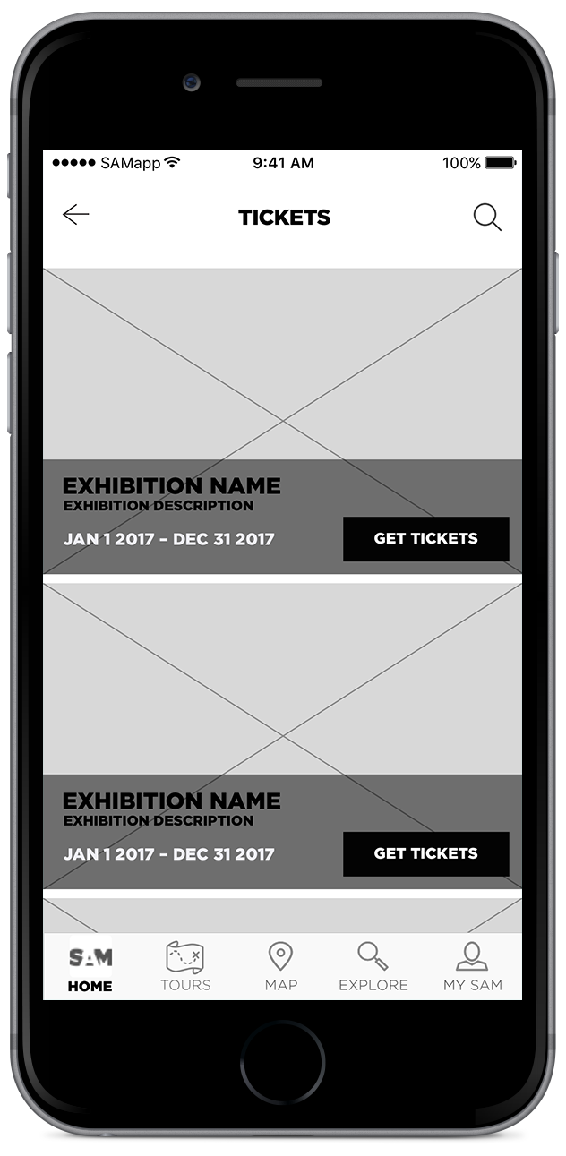
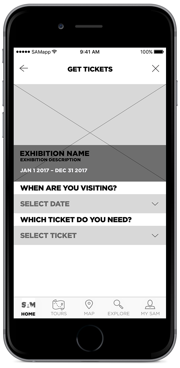
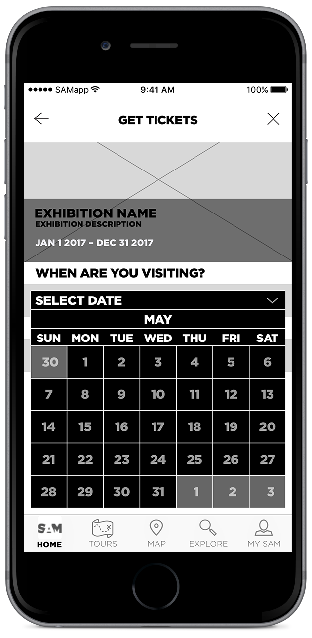
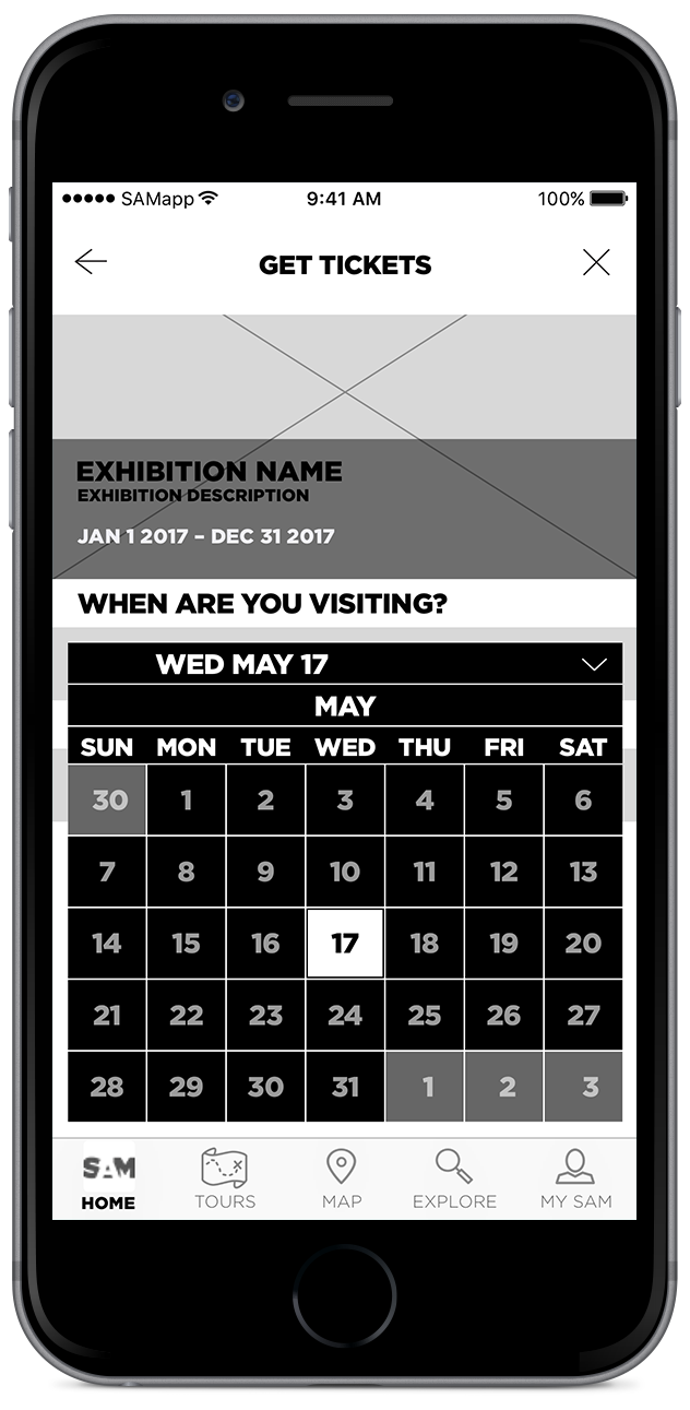
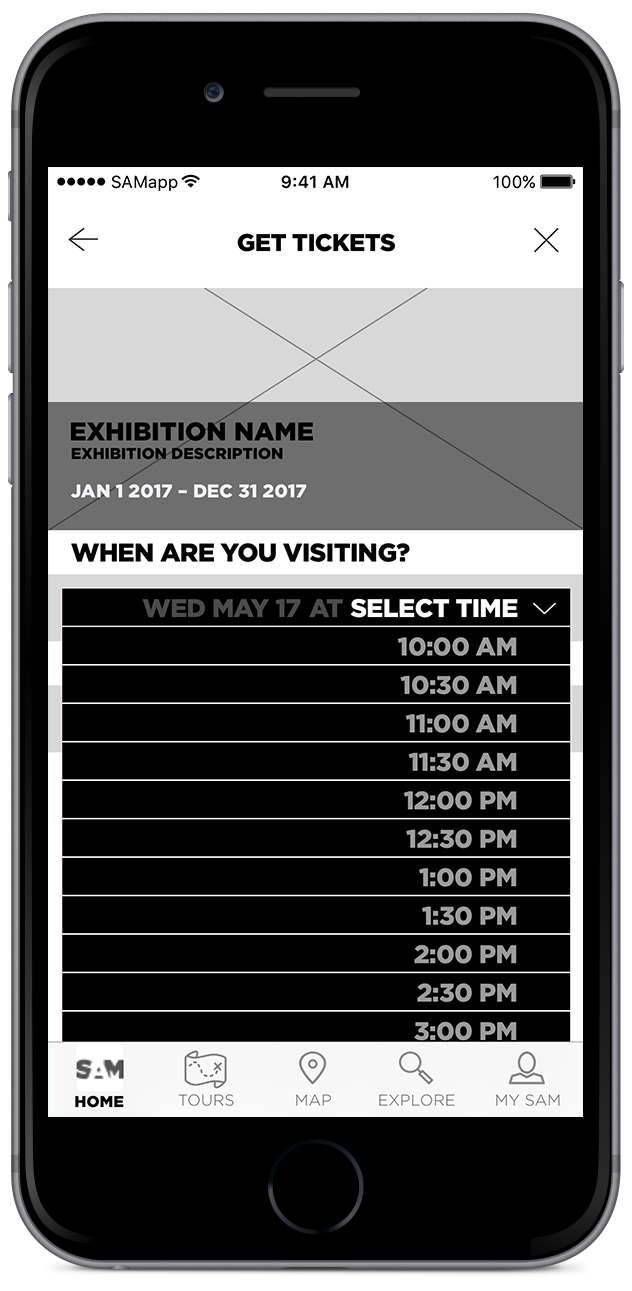
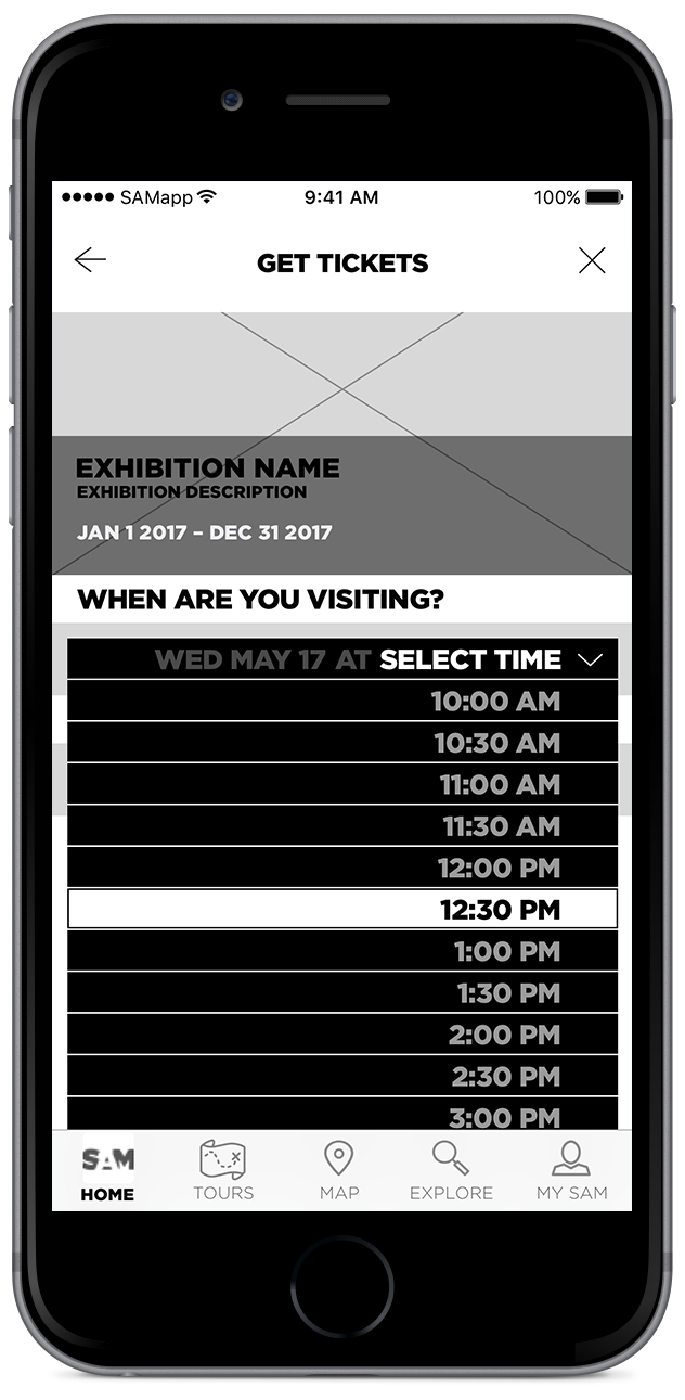
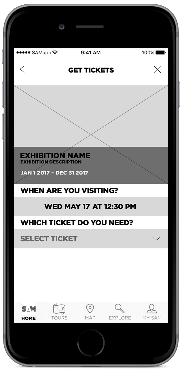
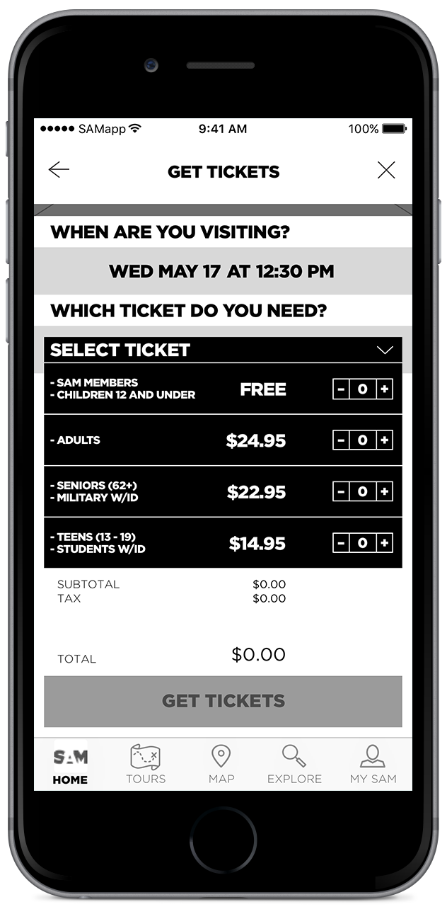
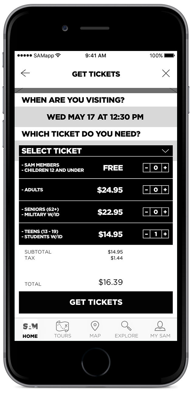
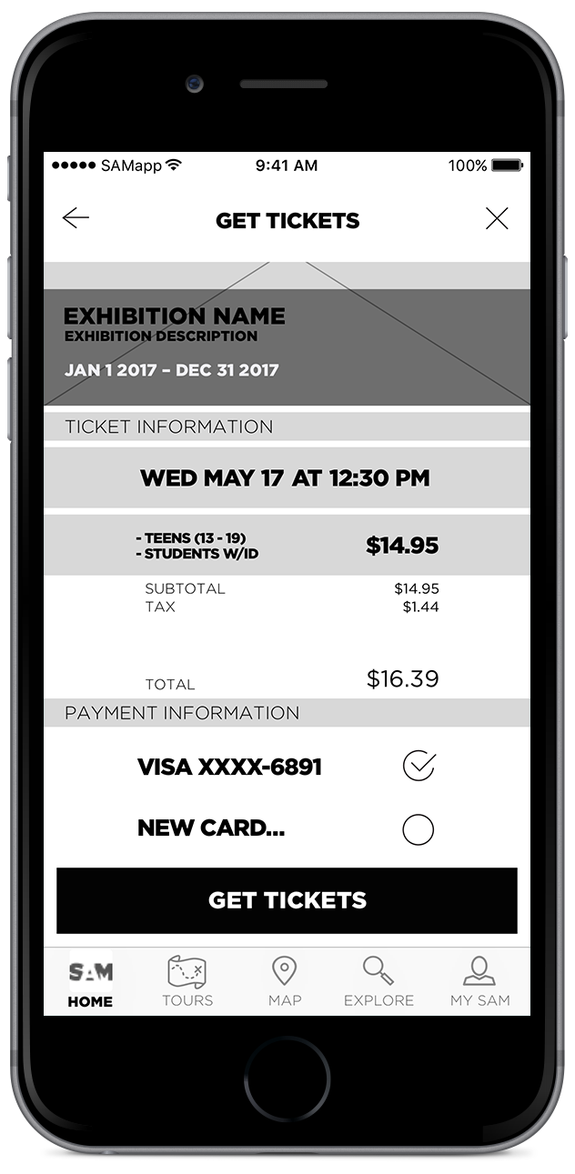
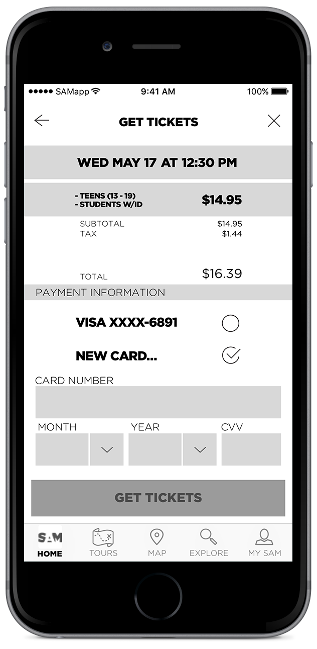
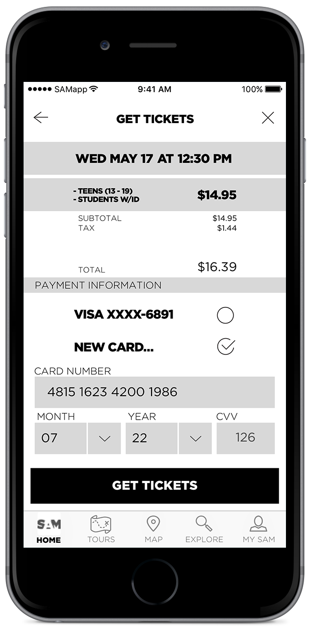
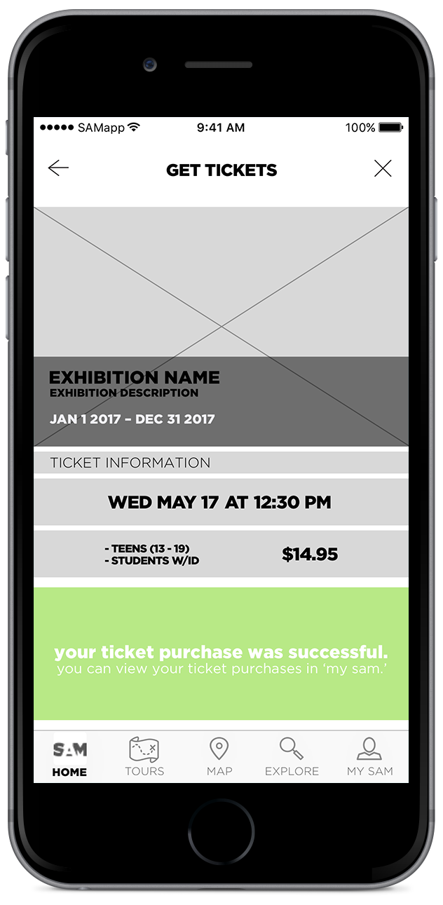
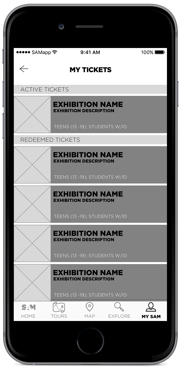
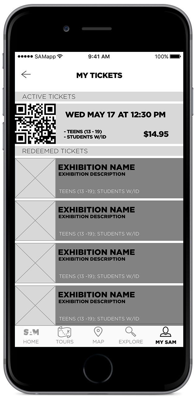
To address SAM's business goals and enhance the overall museum experience, we created user flows for creating self-guided tours within the app which could then be shared with friends. We also created flows for in-app ticket purchases and a QR-code based check-in system to streamline the museum's admisions process.
Since our users wanted a way to access additional information on an artist or art object from within the app itself, we opted to make the musuem's entire collection searchable. In addition, exhibitions would be enhanced with "digital beacons" for key art objects. These would use Bluetooth technology to determine the user's proximity to a given art object, which would then allow the app to display a digital placard with relevant, detailed information. Users would also be able to create bookmarks for objects, enabling them to read more later or add the object to a self-guided tour.

Ticket purchase user flow.

Early Sketches
While sketching key screens for creating self-guided tours, I drew inspiration from similar companion apps by the MOMA, Smithsonian, and Art Institute of Chicago, with the goal of incorporating features that most directly addressed user wants and needs uncovered in our user research.

Key screens for creating custom tours

SAM event notifications bring users directly to event detail view in the app

Early concept for batch-adding nearby art objects to a custom tour
Paper Prototypes
I created simple paper prototypes to perform usability testing of each user flow and validate our designs. The set of user tasks was comprehensive—in addition to ticket purchases, we had users attempt to locate their QR code for self check-in, locate additional information for a specific art object, bookmark an art object to reference later, create and share a custom tour, find their location inside the museum, and discover upcoming events at SAM.

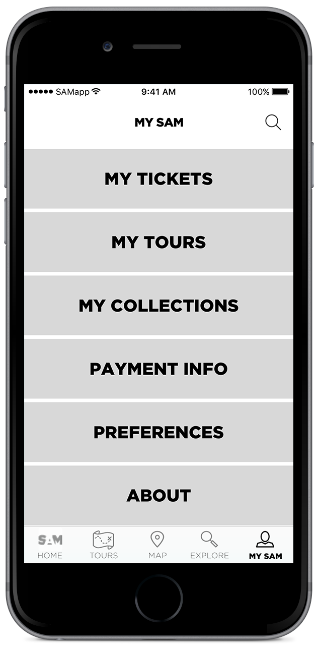
Wireframes
Conclusion
Since SAMapp was a conceptual app, we could only qualitatively assess how well our design accomplished the goals defined in the project brief. We performed usability testing and conducted follow-up interviews to evaluate the effectiveness of our design and found that SAMapp exceeded expectations, particularly with regard to ticket purchases and proximity-based information discovery for art objects.

Other aspects of the app were qualified successes—the ability to create and share a custom tour was one such feature. While usability testing indicated that users were able to complete tasks related to creating and sharing custom tours, our follow-up interviews revealed little actual interest in using this feature. However, all of our users expressed an interest in taking (and sharing!) self-guided tours created and curated by SAM.
Overall, the features we designed were described as helpful, effective supplements to the SAM experience, so I can confidently say our team accomplished our goals.
What I'd Do Differently
If I were to go back in time and design this app again, I'd take care to better user test our design thinking. A fair amount of time and effort was spent on the "custom tour" feature, which was ultimately not as valuable as we assumed it would be. A little time spent up front on user testing this idea (instead of jumping straight to usability testing for our design) would have saved us a lot more time in the long run.
What's Next
Aside from higher fidelity, a second phase of this project would almost certainly include streamlined user flows for self-guided tours. I would also test account creation user flows and a configurable profile—having users logged into a profile would allow for a more streamlined ticket purchase flow and facilitate a more customized in-app experience.
Key Takeaways
One idea that this project drove home for me was the value in clearly defining how a team should operate. At the outset, our team was 100% comprised of strangers who were still learning fundamental UX design methodologies and defining their individual design workflows. A side effect of this was that we were all initially trying to design in a silo, which resulted in duplicated work and some confusing wheel-spinning.
Acknowledging this problem and defining processes for how we would communicate and collaborate (as well as assigning roles for individual team members) was a critical turning point that allowed us to design much more effectively as a team. Having this conversation was such an impactful, revelatory moment for me that it became the first conversation I initiated with my next design team on day one.