the client
Zaahah is an education technology startup with the goal of changing the way students engage with their schools. Uniquely focused outside of the classroom, their aim is to become a singular resource enabling students to explore and share their interests with other students, discovering and managing extracurricular activities, and allowing their parents and teachers to communicate non-academic information.
The Challenge
“If Facebook helps a user connect to 10 people in their first seven days on the site, that user is hooked. How can Zaahah create that kind of engagement?”
Zaahah's key challenge: driving recurrent, active app engagement with students Grades 6-12. In our first client meeting, we discussed the scope of what Zaahah was trying to achieve and worked to identify how our team could best help them accomplish those goals (given our limited timeframe).
We decided to begin by identifying what makes an engaging experience for Zaahah’s target users.
Research & Planning
The simplest starting point was to survey our target users (after obtaining their parents’ permission) to learn about the mobile apps that consume most of their screen time.
Which apps are their favorites, and what do they like most about those favorites? Which apps do they use the most to communicate with their friends? We also asked questions around how they usually discover activities they choose to participate in, what compels them to participate, and what frustrates them about finding those activities.
Finally, we asked them to use their imaginations - what if there were an app they could use to find people with the same interests and hobbies? What would it look like, and how do they think it should work?
Clear trends began to emerge when we synthesized the data from our survey responses. Apps like SnapChat and Instagram were far and away the preferred means of communication among our participants (even if it was forbidden by their parents). And almost all of them considered the participation of their friends when deciding to join clubs, teams, or attend after-school activities.
Zaahah isn't trying to be the next SnapChat or Instagram. However, given how familiar our target users are with those apps, we began thinking about the core features of those apps that could set Zaahah apart from competitors in the edTech space.
The data we collected from our research helped us craft 3 personas embodying 3 different student archetypes in our target user group.
Jack: the Friend-Seeker.
Mekonan: the Mathlete.
Sunny: the Social Senior.
Many of our design decisions were made with Jack in mind. If we could design an engaging experience for students like Jack, they could grow into more involved students like Mekonan – and they could continue to use Zaahah through their senior year of high school and during the college application process (part of the product vision shared with us by Zaahah's CEO).
In other words: making Jack our primary persona allowed us to address the needs of all three.
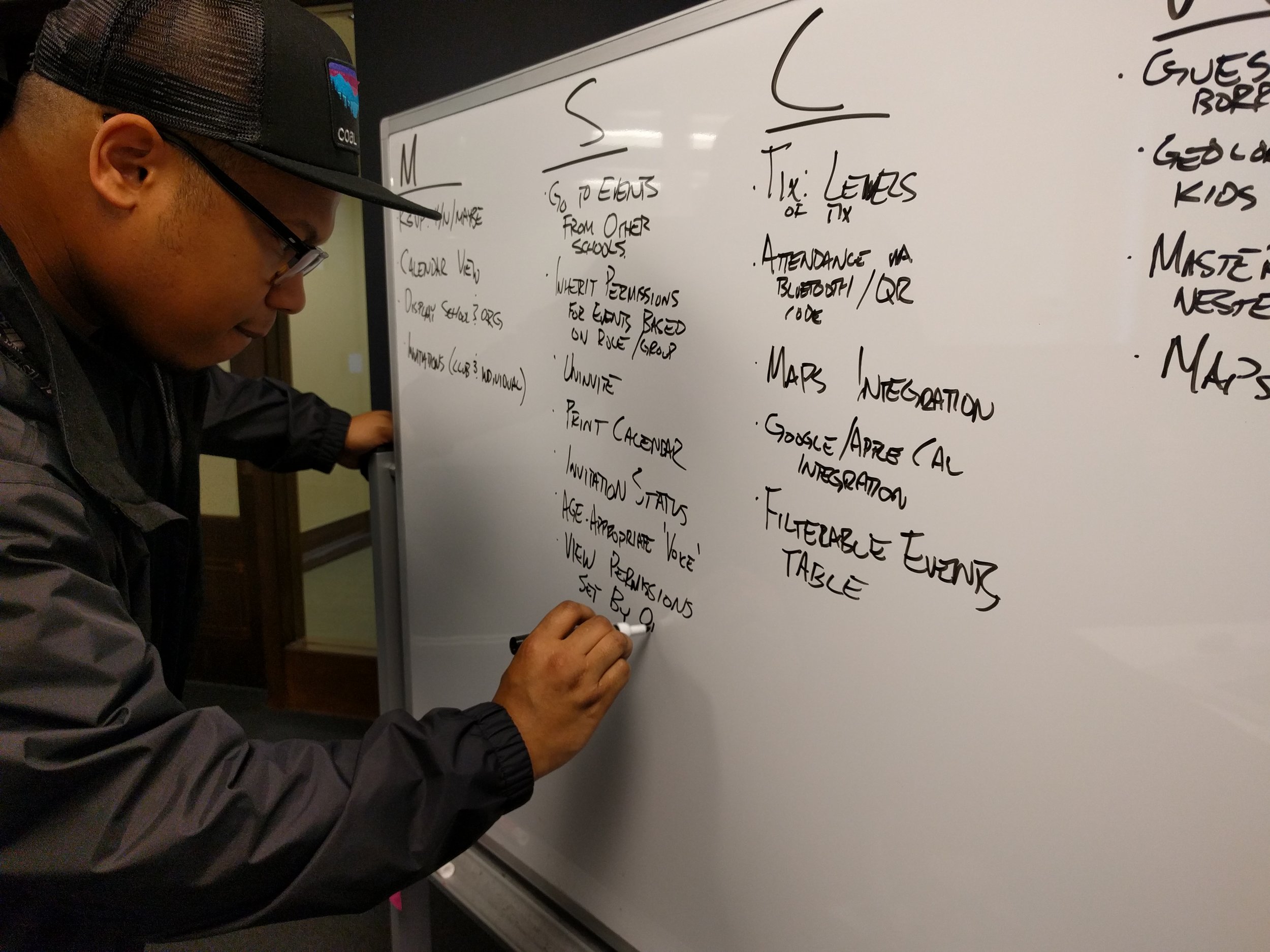
Around this point in our design process, our client sent us a list of features that he collected while performing some of his own interviews with members of the Association of Washington Student Leaders. We considered the value each of these features would have to a student like Jack, in addition to how well they would help accomplish Zaahah’s stated goals for the platform.
Using the Moscow method for feature prioritization.
One recurring challenge that cropped up during discussions (with and without our client) was determining how much actual value a given feature would have to a student like Jack. Due to limited time and access to members of our target user group, secondary research – in the form of an article on what to consider when designing for teenagers, published by Nielsen Norman Group – provided guidance during feature prioritization and design studio sessions with our client.
Designing The solution
User Flows
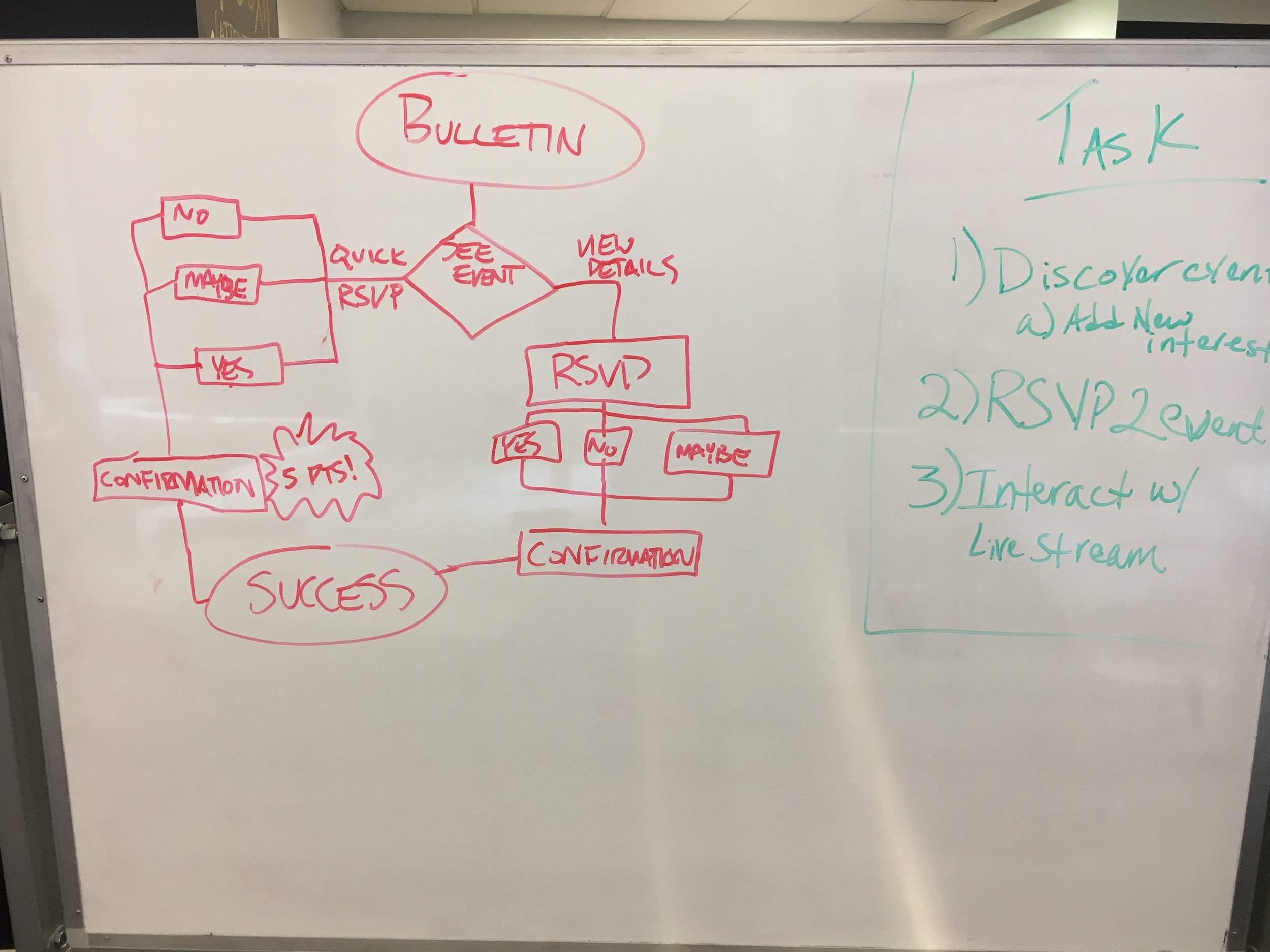
Based on our research, I hypothesized that short, simple user flows would be key in getting students to opt into events and engage with user-submitted content in their feed without getting distracted or overwhelmed along the way. As a team, we decided to test the idea of encouraging more interaction with the app by awarding points for certain actions, like uploading images or live-streaming an event, joining a club, or adding interests to their user profile.
Early Sketches
I created multiple versions of the Zaahah feed (the “bulletin”) and event detail views so our UX researcher could test ideas around the ways students might engage with school clubs and events. I also created screen flows for event creation and conceptualized a way for busy students to manage their activities from the in-app calendar.
Early concepts for discovering events (and the associated event details) in the Bulletin
Exploring nearby events; detail view for an in-progress event (with reactions); event invitation concepts
Several iterations of the event discovery design pattern. Key actions from the event detail view were moved into the feed based on user feedback
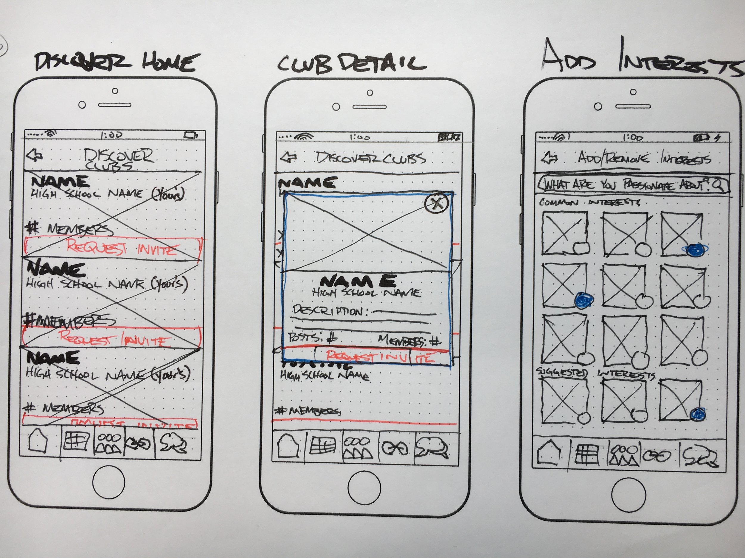
Browsing school clubs, club detail view, and the interest selector screens. Selected interests determine which clubs are presented first
Event creation screen flows and form design. Pre-populated tags map to most popular interests at the event creator's school
Filtering a user's global calendar view to show events from a single club.
Wireframes
Conclusion
If I could do this project again, there are a few things I would have done differently:
Perform heuristic evaluations of the Zaahah website and the app
Advocate for usability testing of the existing product before adding new features
Encourage our client to accept detailed reports on the above as our key deliverables
In hindsight, I think there were a couple of opportunities where we could have made the case to our client for us to shift our focus to UX research. Instead, we continued to design and iterate upon new features, although during our client presentation we were able to make recommendations for addressing usability issues and suggested more in-depth UX research as some of their next steps.
With that said, I had the opportunity to speak to our client several weeks after we wrapped our project. I was pleased to learn that he has been able to use our screens and user flows to inform the direction of Zaahah’s product. I’m excited to hear more about the success of their platform as they continue to mature.
Hi-fidelity comp: Haley Green


